Want to get rid of the annoying adverts? The answer is simple. There are 4 levels of advertising on AnimeOTK:
Level 1: (Your Level, guests and members with 0-9 posts) has maximum advertising. Level 2: (A user with 10 or more posts who has been a member over two weeks) have vastly reduced advertising (including removal of the large full screen closable adverts) Level 3: (A member who has been registered over a month and has over 50 posts, or has a special account like "artist" or "writer" sees minimal advertising. Level 4: (VIP Donators) receive no advertising.
All donators of $10 or more will never see an advert on our site again!
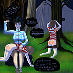
Sorry for the change in text style, I still don't know which one I like more! >.<;;
I tried starting to make my own pattern/water/grass textures to pop in for detail to make the picture get done quicker. Does it look good? bad? gimme feedback please!!
I definately preffer your hand writting . I just love the teacher's expression , no srsly I love it so damn much , it looks so familiar but I can't put my finger on it.
Also really adorable bum that lil girl has :3
evrythingh looks good. My only suggestion is to add some grasses around boy's ankles and the sleeping-bag to make it a bit more realistic. Without that grass kinda looks like the flat pattern on the grounf - but not because it is bad by itself.
Very nice scene! I'm waiting for more! ^__^
Very lovely~
I see she's swapped for a boyfriend-shirt or somesuch pyjama top for this sorta activity~
Not that I blame her, looks chilly... wouldn't want to expose bare parts except legs to that sort of climate ^^
Great drawing~
To give feedback on the grass, it has been said arleady. I think it ties into the rear tree roots well (although the tree itself seems a little imposed, the way the spankee kid has isn't nestled against it but seems to be an anomalous distance away) but less so the nearside ones. I think it ties into the tent lines just fine.
It's the pocket dimension to the small magellanic cloud the still un-named spanker is sat ontop of that breaks my concentration. Is that... supposed to be a rolled up futon?
If so... yo, dat's well mashed bling-bling pimping tight and shit.
Compare that to the paw-print shirt and rose panties and I'm sensing a break in the pattern, the grass doesn't seem to break into that so well and I might have drawn it (if I was able) with the grass between the spankees splayed fingers. The way he's being hefted over you'd think the weight would be forwards a little - not a lot - and create that effect? The issue seems to be with it interacting with foreground objects. The translation point where it engages with the background and where it interfaces from floor to wall is great.
As a brush, its superb and the mix of green/brown is spot-on for me.
In other news, I thought I wrote someting about your speech-bubbles on a previous comment - I note that this comic has the hand-written ones, previous drawings of yours alter between at least three different ones in the last few months.
Are you trying to find a style you like? For what its worth, I like this one.