Want to get rid of the annoying adverts? The answer is simple. There are 4 levels of advertising on AnimeOTK:
Level 1: (Your Level, guests and members with 0-9 posts) has maximum advertising. Level 2: (A user with 10 or more posts who has been a member over two weeks) have vastly reduced advertising (including removal of the large full screen closable adverts) Level 3: (A member who has been registered over a month and has over 50 posts, or has a special account like "artist" or "writer" sees minimal advertising. Level 4: (VIP Donators) receive no advertising.
All donators of $10 or more will never see an advert on our site again!
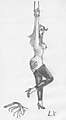
Like a lot of your work, this seems to smack of referencing - which is perfectly okay when starting, especially when using pencils - but seems to highlight details you need work on.
With a lot of your other things, its almost possible to see the point at which whatever souce you were using ran out; limbs that suddenly go haywire, cleavage and chests that become malformed and the massive shortening, shrinkage in other drawings.
This one is your best proportioned that you've posted so I'll comment here to say you still need to work on getting the size of everything right. The feet look too small, the legs seem to thin and the arms taper away almost to nothing, boobs I'm not to sure about.
That said, the shading is incredibly good, the patterning and light-sourcing may not be perfect but the effect is great. The picture is clean and appealing, I love the pose (although again, that may be partially down to the original reference) and the kicking and character details. Her heels and leggings are very well realised.
What I suggest you work on more is the 'disappearing' of your characters at the top and bottom. Arms and legs just get smaller and smaller until they're out-of-scale.
This is a prime example of a picture that probably would look better inked - of course make the copy before starting!