Want to get rid of the annoying adverts? The answer is simple. There are 4 levels of advertising on AnimeOTK:
Level 1: (Your Level, guests and members with 0-9 posts) has maximum advertising. Level 2: (A user with 10 or more posts who has been a member over two weeks) have vastly reduced advertising (including removal of the large full screen closable adverts) Level 3: (A member who has been registered over a month and has over 50 posts, or has a special account like "artist" or "writer" sees minimal advertising. Level 4: (VIP Donators) receive no advertising.
All donators of $10 or more will never see an advert on our site again!
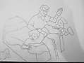
This is the first piece of spanking art I have ever drawn by hand as opposed to via computer.
I will be adding clolour to it really soon but thought I would show how it started out first
You're doing great so far...straighten out a few details and sharpen the image a little bit...also brightening it a bit probably couldn't hurt. A great opener and I certainly hope to see more ^_^
The outlines and perspectives seem quite adequate to the task. Viewpoint seems to work correctly for the scale of the charactrs. I'd say that proportion of the heads to the bodies arnt quite dead-on but the shape of them is fine.
The big problem is the bed, the isometric falls right downhill as you get away from the characters, the background sorta makes it look lopsided - which is a shame because as a basic lineart background goes its perfectly up to the job.
The thing I'd suggest you need to work on is volume. Linking the curved lines which suggest folds in the cloth to their perfect cut-out exterior border lines to give a suggestion of shape and compressed volume. Same goes for the characters, they look a little cut-out from the pose and without depth or weight. The flat-shape of the bed adds to that sense. Compared with most recent postings from 'early' artists to this site, its well above average.